What Presentation Tool Should I Choose!? 2021 Edition

As someone that gets a lot of requests to build a lot of decks, I’ve had my fair share of switching between tools, either based on preference or what’s best for the client. No doubt, context switching is a buzzkill for my productivity. Even with shortcuts deeply ingrained and intentionally programmed into my mouse/keyboard, all of that gets put into a salad spinner whenever I close Google Slides, open PowerPoint. Close PowerPoint, open Figma. Close FIgma, open Keynote. Close Keynote, open Pitch. Close Pitch open - OKAY, you get it. Shortcuts don’t always translate. Mental models for where settings are get jumbled. Though the fact is that each tool excels in their own way. There is no greatest. Greatness depends on context, always.
BUT… if you’re in a position similar to me, where you’re not tied to any one particular tool (aka your organization doesn’t put the hammer down on you), or maybe you’re trying to advise your client which tool best suits them, then here’s a breakdown for you:
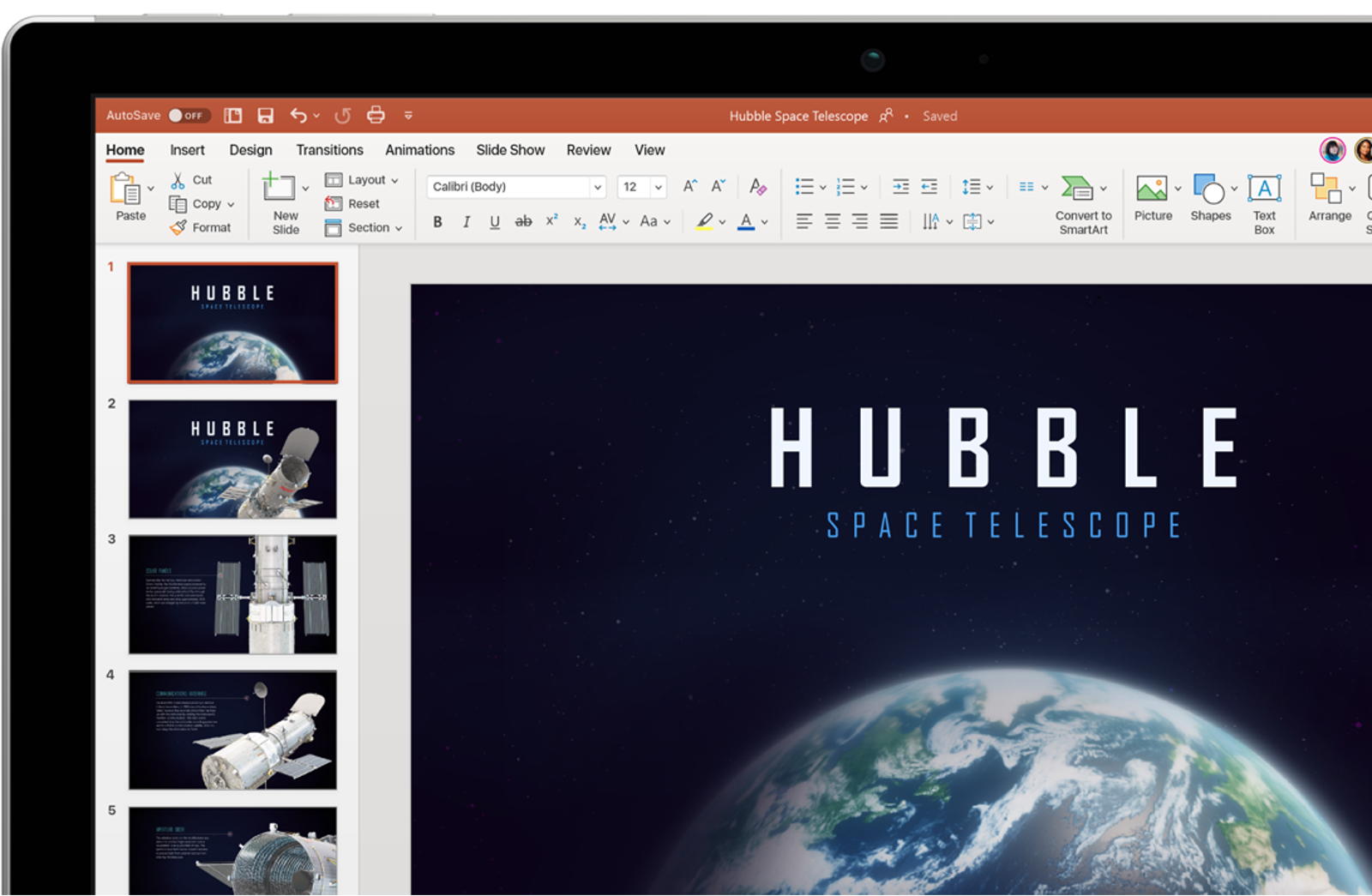
PowerPoint

Best For…
Corporate life. Kidding, but not really. Large organizations tend to continue using tools that’ve been around the block for a while, and so Microsoft wins this round. It’s also intuitive for PC users, which most people in this bucket tend to fall into.
I don’t hate on it even though the mere utterance of the name seems to have a dispiriting effect on most people. But honestly, it’s powerful. Look beyond the mirage of past preconceptions and you’ll find a host of advanced settings that let you manipulate down to the nitty gritty in ways that other tools on this list can’t. 3D shapes, you’re good. Swapping colors on SVG icons, you’re good. Custom path animations, you’re good. The benefit of that is you can build highly unique visuals directly in the tool without needing to import them in from elsewhere as a picture. That way, everything remains editable in .PPT.
Might Avoid If…
You only need the basics. Having plenty of settings and options is great if you’re familiar with how to use them, but could be distracting otherwise. You’re working with a blank canvas with minimal guidelines on where to start. Sure, they have pre-designed Themes for you the same way Google Slides does, but to be honest they are VERY. DATED. They also have a feature called PowerPoint Designer (under Design > Design Ideas), which supposedly helps you auto generate layouts based on what’s on your slide but I’d say it’s also pretty atrocious. I see them improving in future releases, but as of now, the feature still feels stuck in early 2000’s corporate life.
Google Slides

Best For…
Projects that require a good amount of collaboration. Not new to the scene by any means, but with features that let you leave comments, assign tasks, see live edits, and create different levels of shared access, all of that is pretty useful when you have 5+ people floating around a deck. Not to mention, its Revision History feature alone can give you a good night’s sleep
Startups or growth companies love using Google Workspace, and that’s pretty true across the industry board. It’s probably because cloud-based office tools are much more functional than say, Microsoft desktop tools that are making their way to the cloud, but definitely with a lag. Its connectivity with Google Sheets, as in the ability to add a graph, linked to data in Sheets, that will auto-update every time is also quite a bonus.
Might Avoid If…
You’re building a presentation that requires hella showmanship. Flashy keynotes to show major product releases that aim to entertain as much as inform, for instance. You know the ones with motion design that make you wonder if it was built in After Effects? Those. Animations are a thumbs down with this tool, which is fine for probably 90% of your presentation use cases. Other than that, if you’ve got a special font, or even just a company font that you need to stick to, beware of Google Slides. While they do have a range of options, and you can even download more, you are restricted to their set and their set only.
Figma

Best For…
Figma is a well-known tool for design but a lesser known tool for presentations. My friend Zach, will tell you that Figma for presentations is a thumbs up! He’s really great with it, and even created this how-to-use article and video tutorial on creating template slides. It gives you the best workflows you’d find as a UX or UI designer and applies them to the presentation world.
Instead of “Master Slides” (a term you’d commonly find in PowerPoint or Slides), you can build Components. They work similarly in that you can update something once, and see those changes applied across multiple areas. But more impressively, you can also set Styles for texts so you can maintain consistent type settings for headers, subheaders, and body copy every time (just one of their unique traits).
You kind of have to adjust your language when you use Figma, as in, don’t think in slides but in frames, that sort of thing. It’s an interesting transition from using a “strictly presentation” tool, but once you build the muscle memory, it’s an easy option to pick up, especially if you’re used to Adobe tools (your workflow will likely be similar). Oh, and use the desktop version. It’s much quicker.
Might Avoid If...
You’re looking to adopt something for your whole team to use. Not everyone might be comfortable with it as it does live more in the design world, and less in the office one. Also, presentations that are meant to be shared out I probably wouldn’t risk building in Figma (unless you’re going to export it as a PDF). Imagine an investor expecting to flip through a deck, and instead needing to zoom into a frame. It’s a mindfuck. I’d also recommend something else on this list if you’re trying to build complex animations (though you can use Figma’s prototyping tools).
Pitch

Best For…
Non-designers that want to produce something that people will say, “wow, looks great”! This is the ultimate tool for making awesome looking decks, with the least amount of effort. There is literally an option called Tidy with a wand beside it that will automatically clean your formatting/alignment for you. The first time I used it, things just clicked into place. Quite literally, images will rearrange to pixel perfection on their own.
They also try to simplify everything down for you making you feel like everything that exists on the screen will serve a purpose. This is good for someone who just wants to get shit done, and have it look good. And if you don’t feel like making it look good on your own, they also have prebuilt themes that DON’T give out an early 2000’s corporate vibe. They’re really quite good I’d say. Last thing here, they’re great at making resources you’ll need accessible. With native integrations with Unsplash, Giphy, and Icons8, you often don’t need to go outside to pull in the perfect image, GIF, or icon.
Might Avoid If...
You’re building data-driven presentations that are backed by charts and graphs. They do have a charts feature, but as the new kid on the block, it’s still yet to be fully robust. I still have to paste in pictures of graphs created outside of the tool. If you’re into editing shapes and images into custom formats, it’s also quite restricted there. But that’s to be expected with any new tool. With very frequent new releases and updates, I’m sure it will get there. Though I would caution, as Pitch prides itself on being super easy to use, I might not hold out for more advanced functionality in the short to medium term, the kind that PowerPoint or Keynote might offer. Speaking of, they also don’t currently support importing or exporting Pitch files to PowerPoint or Keynote files. This makes migrating back and forth as a multi-user a bit tricky. Now, onto Keynote....
Keynote

Best For…
Keynote is a beloved tool that’s basically the lovechild of PowerPoint and Pitch. It’s got the same powerful functionalities of the prior, while being intuitive and a great experience to use like the latter. One thing it does particularly well is work seamlessly across Apple devices - desktop, mobile, or tablet. That helps shorten turnaround time if you’re waiting on eyes to see your deck for review, as they can do so on to go. Other than that, Keynote also supports multimedia particularly well- sounds, videos, GIFs. They embed well into your slides, without it feeling clunky and bogged down like it does in say, PowerPoint or Google Slides.
I find creative agencies are really into using Keynote. It makes sense given their propensity for design-driven deliverables. Keynote does let you create presentations that feel polished, especially since their features let you create motion in a way that feels nature and smart. They have something called Magic Move which lets images or text from one slide transition to the next seamlessly, which can be neat. Granted, PowerPoint has something called Morph, which lets you do something similar, but let the record show it was definitely late to the party.
Might Avoid If…
Not everyone in your ecosystem is using Mac. Keynote is not available on other types of operating systems (save iPad OS and iOS), and while you can save your Keynote as a .ppt or .pdf file, it’s an extra step that’s open to errors. It’s also got a bit of a steeper learning curve, than say Pitch, and takes a bit of commitment to master. Because it’s not nearly as ubiquitous as Google Slides or PowerPoint, you won’t find the same abundance of resources available online, though surely, you’ll find enough if your end goal is to pick it up and not master every element.
No one tool to rule them all
All in all, these tools do play decently with one another if you ever find yourself needing to migrate between them. You can upload a PowerPoint into Google Slides, or open a Keynote in PowerPoint with decent preservation both ways.
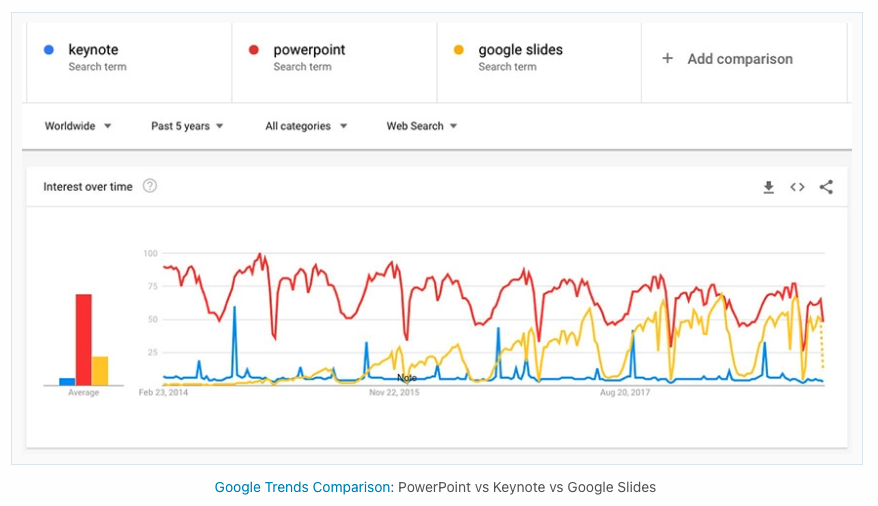
I did come down hard in the intro by saying my productivity lowers when needing to switch between tools. But the real matter of fact is that they all give a unique competitive edge. Some people like to rank tools based on a comparison of their features but let’s recognize that what’s valuable for one user, might not be for the next. Interesting to note though, based on search terms, PowerPoint finally seems to be losing its popularity over to Google Slides...

Source: envato tuts
It goes to show even expert tools will falter if your stakeholders aren’t able to connect with them. Best-in-class tools will continue to win market share over legacy ones but in the meantime… just make sure that everyone that needs to collaborate, can, while not limiting yourself to creating the best product you can.


