Using Figma for Presentations: 2021 Update
In 2017, I published Using Figma for Presentations. At the time, Figma was still in beta (and didn’t even have prototyping yet!), and most design teams I knew were skeptical about it as a tool — and of collaborative designing as a concept.
Since then, Figma has grown to hundreds of thousands of users, with design teams from some of the most recognizable brands in the world using it daily. Also, since then, I joined and left Figma as a design education manager and community advocate, and have started my presentation design agency, Zacht Studios.
I’m still betting on Figma to be a significant player in the presentation tool game. I wanted to update that 2017 article with the new strategies I’ve learned and the new Figma features added since to create and present with Figma even better.
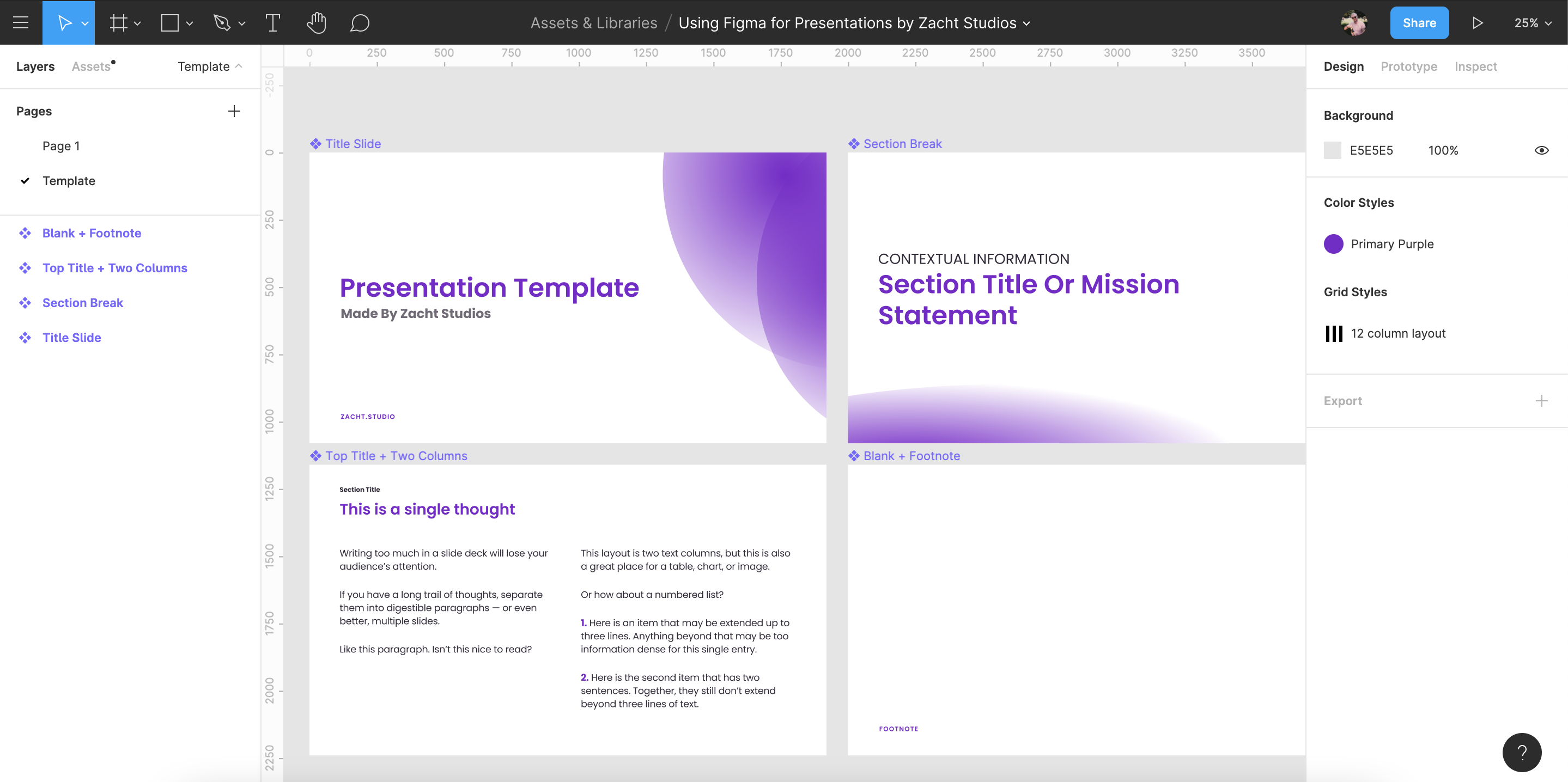
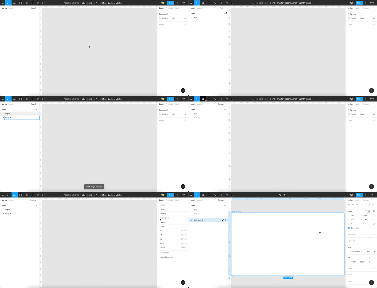
First, I like to set up a new Figma file with the intention of creating a presentation:
Template Slides
I like to stick these on a separate page in my Figma file to keep my documents tidy.
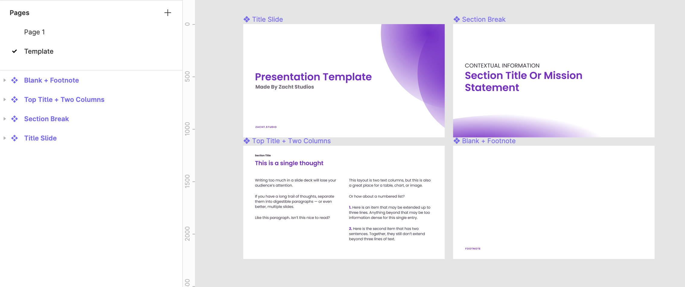
Using Figma Components, create the base of each slide type. For example, a title slide, a section break, a top title, and a blank slide with just a footnote.
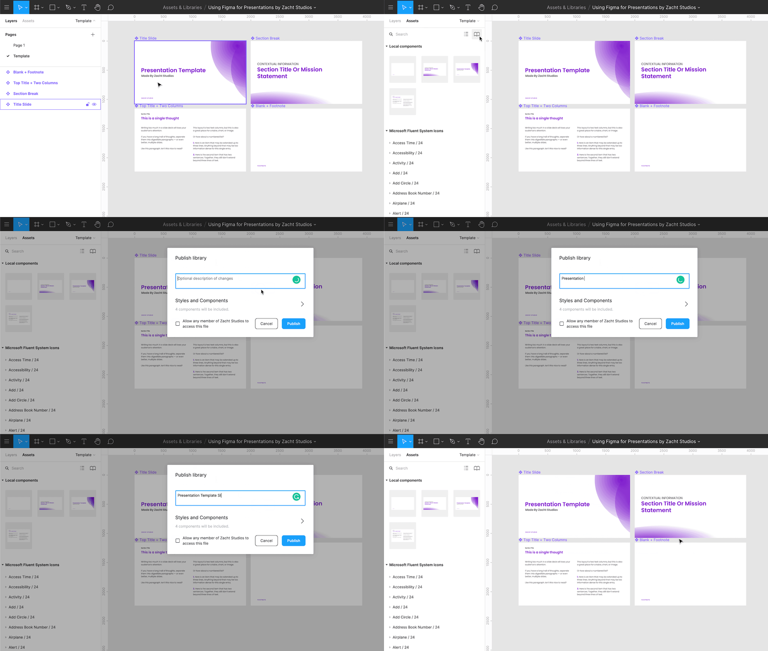
Since I am setting these as Components, I can use them in this file, and I will also publish them to the Team Library, so anyone at Zacht Studios can access them.
The next step is to go back to that original page and start making a deck. I create a new Frame of the same size and place an Instance of one of my Template Components inside it. The reason I do this, instead of just placing an Instance on the canvas by itself, is because I’m going to want to layer other content on top of it.
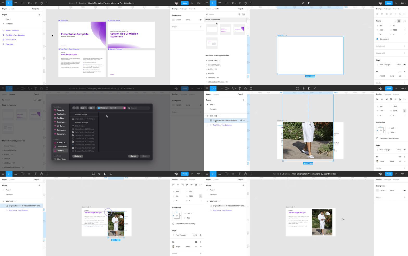
Figma Instances support Overrides. An override is changing a property of an object that is part of the Component. In this case, that could be changing the title of a slide, or it could be something like changing the color or typeface of an element just in one instance. The benefit here is, for example, having a 30 slide presentation created, with each slide having unique content, and then being able to make changes to the template layout rather than each individual slide separately.
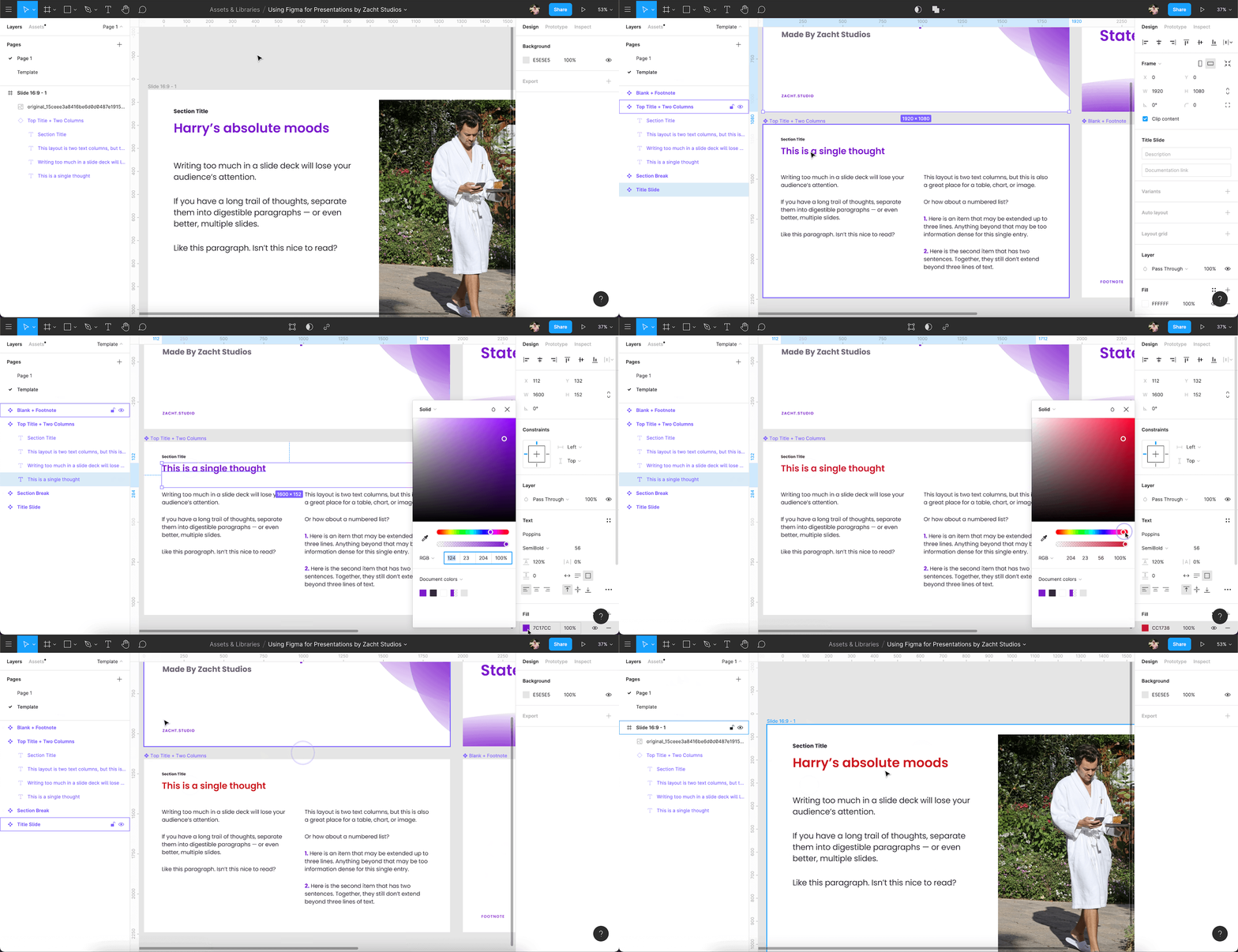
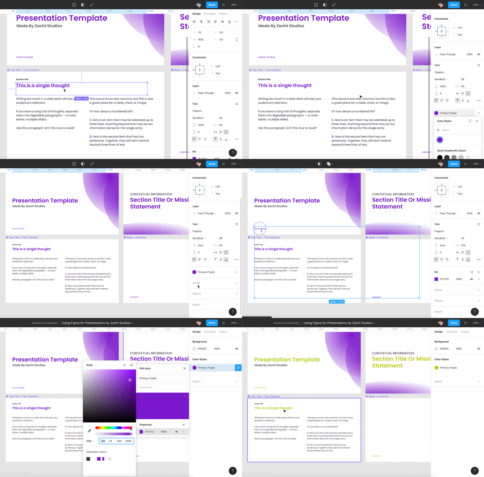
You can also set Styles in your file — or use existing Styles from your Team Library — to adjust type and color choices (among other things) across multiple slides at once, including the template slides.
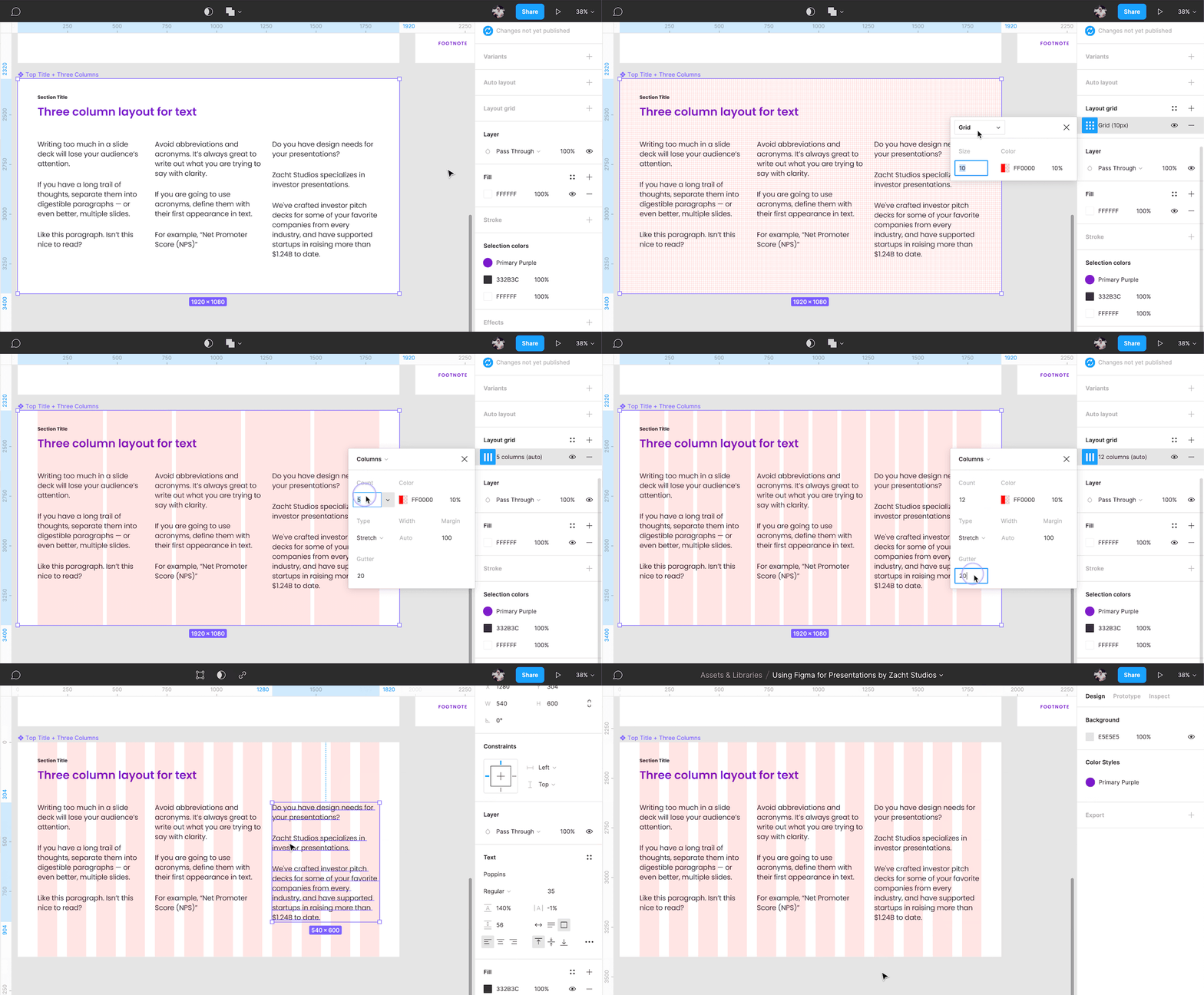
Before I get too far in the content-creation process, I like to set up some additional structure for my slides:
Grids
Figma’s grids are powerful. For me, they help maintain consistency, a critical piece of good presentation design. I usually use just one grid layout of columns for an entire project, but there is a lot of flexibility in Figma if you feel comfortable using multiple grid systems. You can pick any Frame to start with and then save your grid layout as a Style. Then you can use it on any Frame.
Auto Layout
Figma’s auto layout helps maintain spacing rules that you create. Much like Grids, it is another structure that can help maintain consistency.

Now that I have foundational structures in place to lay my content out with confidence, I can use these additional Figma features to mimic more traditional presentation tool features:
Hyperlinks
Any text or text box in Figma can become a hyperlink. Select the text you want to add a link to and the chain icon appears in the toolbar at the top-center of the interface. These are clickable in the Presentation view (more on that in a second) and in exported PDFs. You can also add hyperlinks in Comments.
PDF Export
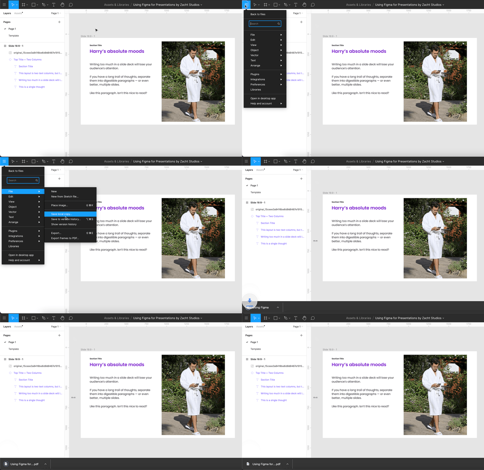
You can export your deck as a single PDF file by going to File > Export frames to PDF. Figma will generate a PDF with every Frame on the current Page — another reason to set up your Template Slides on a separate page. Figma organizes Frames left-to-right, top-to-bottom and your PDF pages will follow that order (so will your slideshow in Presentation view, unless you adjust with the Prototype panel).
Sharing/Collaborating
This hasn’t changed much since my original article: “By clicking the share button in the top right corner, you can enter an email address to invite others to collaborate, or generate a shareable link.”
Some of my favorite Figma collaborative features, that eclipse presentation tools like Google Slides, are Observation Mode and Embedding.
Presenting
When in Presentation mode, using the keyboard shortcut "⌘\" on macOS or "^\" on Chrome OS and Windows hides the toolbar and footer.
If you are going to embed a Figma file on a webpage or share the Presentation mode link with someone else, you can add "&hide-ui=1" to the end of the URL to keep the toolbar and footer hidden there as well.
Alternatively, you can use the Prototype panel to do this by setting the Device to "Presentation".
Animation (aka Prototyping)
Figma is, first and foremost, an UI design tool. With it being flexible enough to do other types of design work, like presentation design, it’s many features can be used beyond their original intention. Prototyping app screens is a core competency, but using that to animate slides and create Keynote-like transitions is more than possible. Smart animate is the Figma equivalent of Keynote's Magic Move.

Community: Files
Via the Share menu, you can publish your file to the Figma Community. Check out our resources, available for free at figma.com/@zach (me) and figma.com/@zacht (Zacht Studios). Other Figma users will be able to create a duplicate of your file to make their own (they will not be able to edit your original file).

Community: Plugins
As of writing this article, there are hundreds of plugins for Figma.
Here are a few of my favorites:
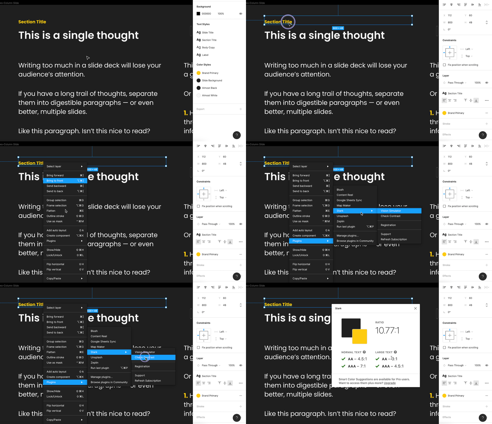
- Stark, contrast checker and colorblind simulator
- Unsplash, free stock photography
- Material Design Icons, Google's icon library
- LottieFiles, use Lotti animations in Figma
- Brandfetch, easily find and place company logos (great for deck making)
- Map Maker, for generating maps directly on the canvas
Additional Tips
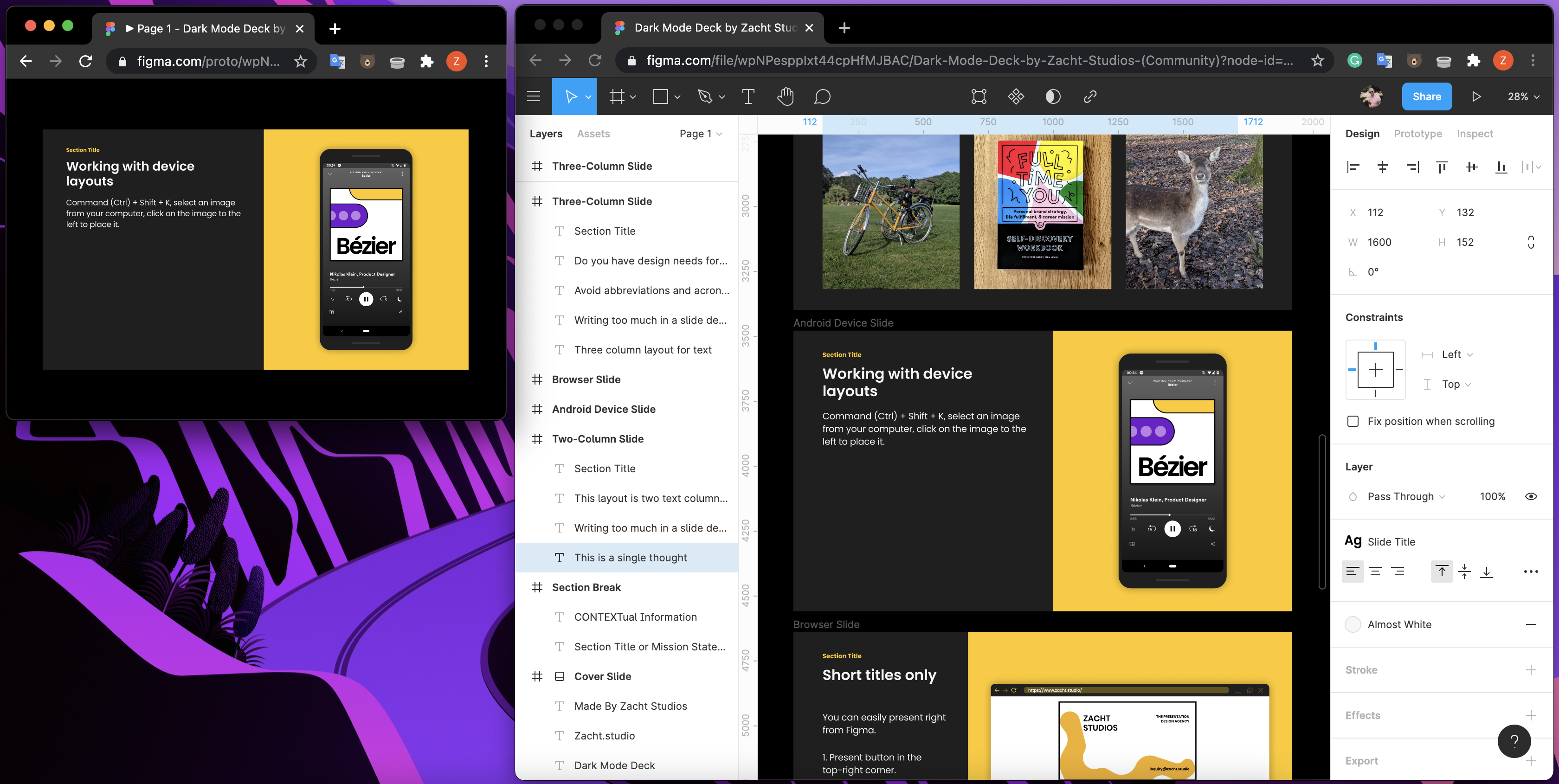
Open your file again in another window with Presentation mode so you can see what your audience is going to see in the presented version of the slide.
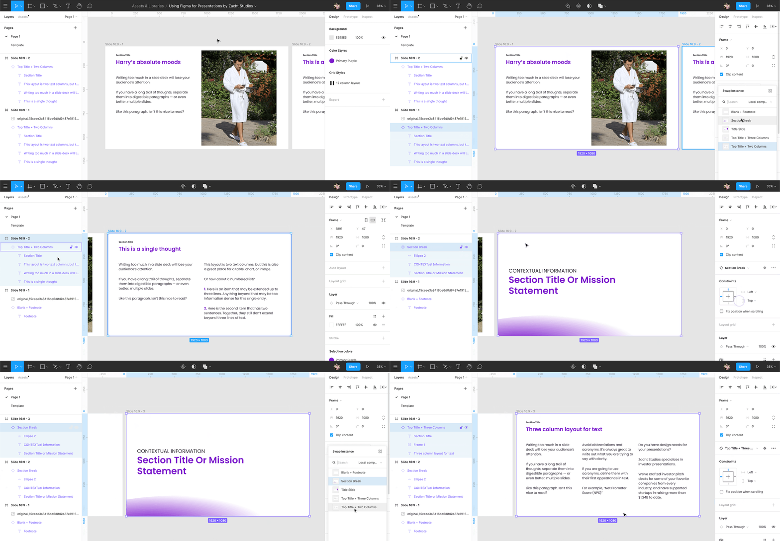
Use Swap Instance to quickly try out your other layouts for a slide or build out additional slides quickly.
All that to say, there are a lot of great features intended initially for screen design that extend to making great slides fast.
If you have questions or additional tips to share, please reach out: inquiry@zacht.studio
________
presentation.design is a resource hub by Zacht Studios, The Presentation Design Agency.
Need help creating that presentation template or pitch deck for your company? Zacht Studios is a team of skilled creatives focused on company storytelling and fundraising.
We’ve crafted pitch decks, marketing materials, and unforgettable stories for some of your favorite companies like Adobe, Square, Etsy, and SpaceX. Plus, we’ve supported startups in raising more than $1.41B to date.
Curious to learn more? Reach us at inquiry@zacht.studio


