How We Built a Swipe File with Pitch

Photo by Sylvia Yang on Unsplash.
Pitch is the new face of presentations. It helps us build much more than conference talks and pitch decks: Bulletins, release notes, and more. It’s more collaborative, effective, and beautiful.
As a marketer, I was looking for a creative way to brainstorm new ideas with my team in Pitch. So we built a swipe file.
What’s the file?
A swipe file is a collection of marketing and UX ideas that inspire us.
A swipe file may include web pages, onboarding flows, and email campaigns that you stumbled upon and that wow you.
The objective? If you’re struggling with creative work, you don’t start from a blank page. You can refer to it for inspiration. It helps you ship better work, faster, with what inspires you the most.
This story is a step-by-step guide to help you build your own.
Make it collaborative to ship better products together
Pitch, and its built-in collaborative features, make it possible for every team member to contribute. You can add your ideas, comment, and react.
It’s also a creative way to onboard your new team members.
Because they must get familiar with your workflow as fast as possible, to endorse your new team members to contribute to your swipe file helps them learn how to use Pitch in a fun and productive way.
How We Built a Swipe File with Pitch
Step 1
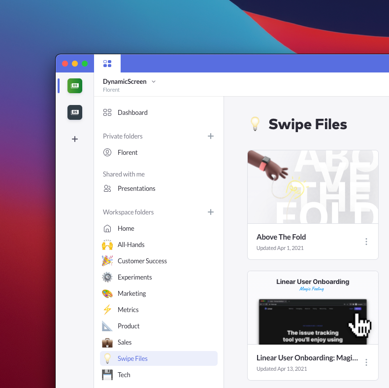
Create a new folder in your workspace.

Step 2
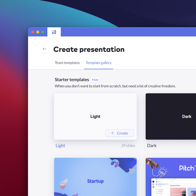
Create a new presentation per topic. I built a Template for that.
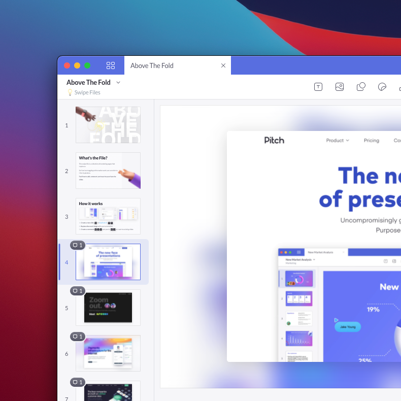
Each presentation has a focus on a specific marketing or UI element. For example, we’ve presentations for ATF sections, Dark UI, and onboarding flows.

Create a new presentation.
Step 3
Start collaborating. Add your favorite shots, and, more importantly, comment and react. 🎉 😍 👏 👍 👎
Comments are essential. They give context. Explain what you prefer the most in your example, why you like it so much, and what made you want to add it to the collection. It helps understand the reasoning behind every pixel and word.

How it works

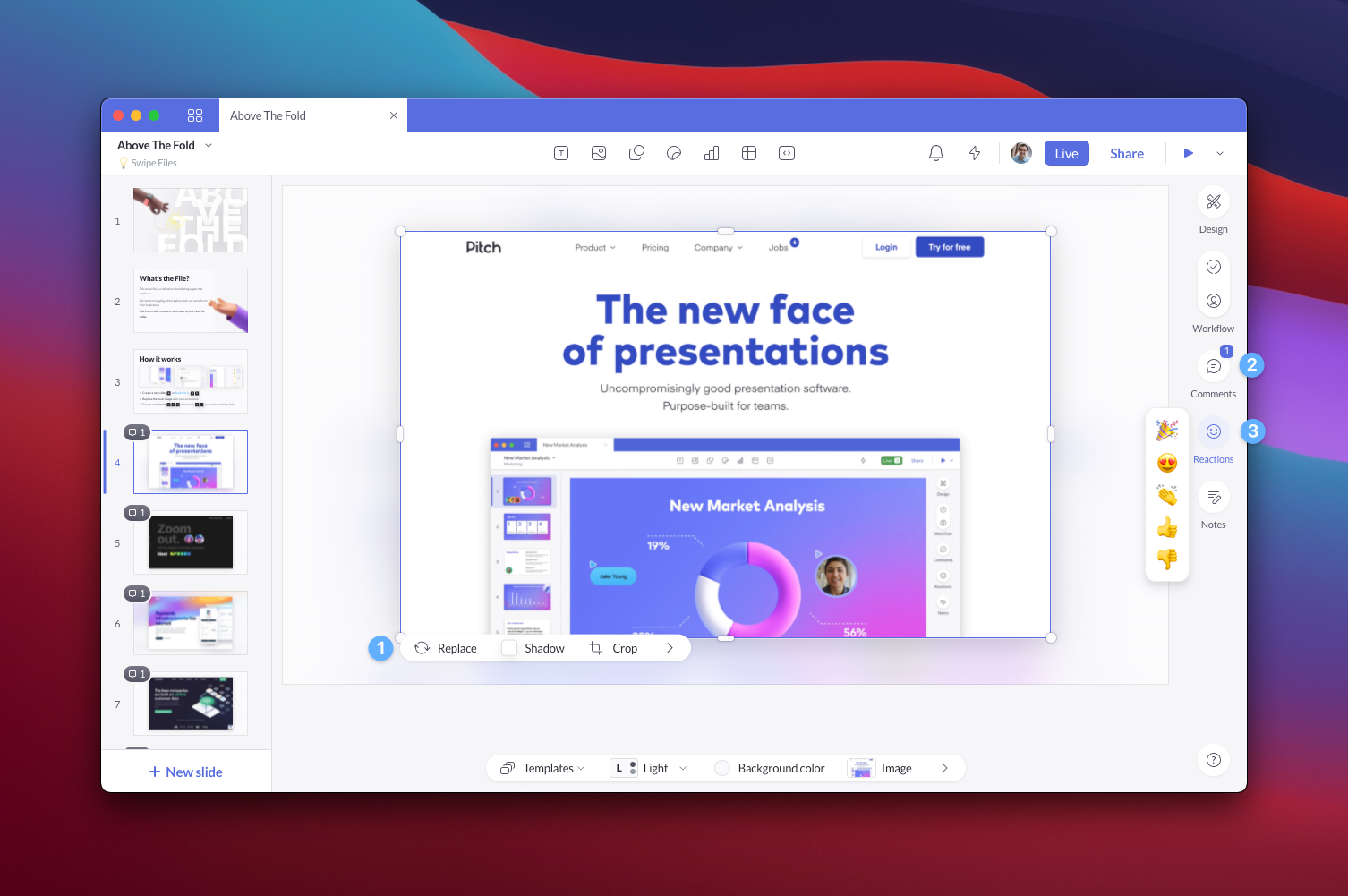
- It all starts with a screenshot. If you visit a page or read an email that wow you, take a screenshot.
- Add it to the collection. Create a new slide, or duplicate it. Replace the main image with your screenshot.
- Then explain why you love it. Create a comment, and post it. You can also contribute by reacting to existing slides.
The best part? Pitch’s iOS app lets you literally swipe slides, comment, and react on-the-go.
Over to you
Feel free to ping me on Twitter @fmerian if you want access to it. I’d be happy to share it with you!
Thanks for reading! If you enjoyed it, please do share the Twitter thread: https://twitter.com/fmerian/status/1388082612598681601


